Forgetting is expensive. It shouldn't be inevitable.
Document expiry is low-frequency but high-stakes. You don't think about it daily, which is exactly why it catches you off guard: a lapsed insurance policy, an expired residence permit flagged at the airport, a warranty that ran out the week before the washing machine broke. No existing app treated expiry as a first-class concern. It was buried inside password managers, filing apps, or generic reminders that make you do all the thinking.
The real user
Anyone dealing with overlapping bureaucratic systems: expats, freelancers, renters. People managing documents across many domains, with no single system watching them.
The gap
Calendar reminders need you to remember to set them. Filing apps are about storage, not urgency. Nothing simply said: here's what's expiring, and here's how long you have.
The privacy constraint
Passports, insurance, visas are sensitive. The app had to work entirely on-device, with no account, no cloud and no tracking. That constraint shaped every architectural decision.
If it expires, it fits. The rule I used to decide what Kelto should track
One screen. Zero confusion.
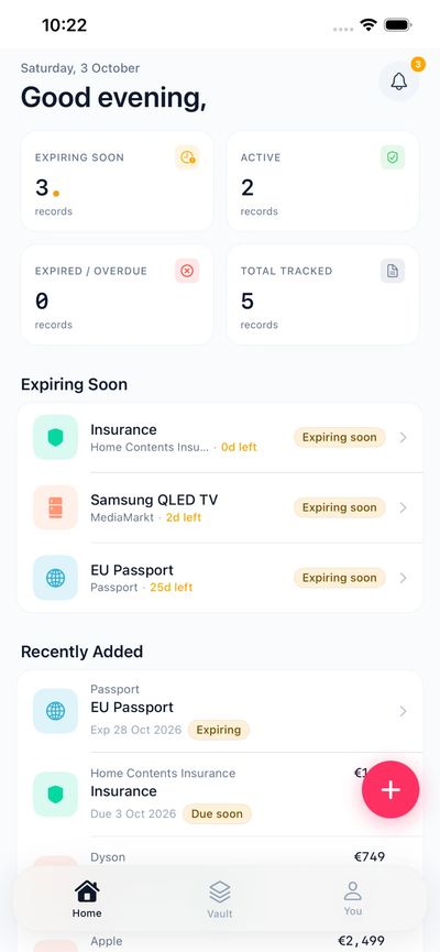
The core challenge wasn't visual, it was informational. How do you surface urgency without creating anxiety? How do you handle Active, Expiring Soon, Expired and No Expiry Set without overwhelming someone who just wants a quick status check?
Status as the primary UI
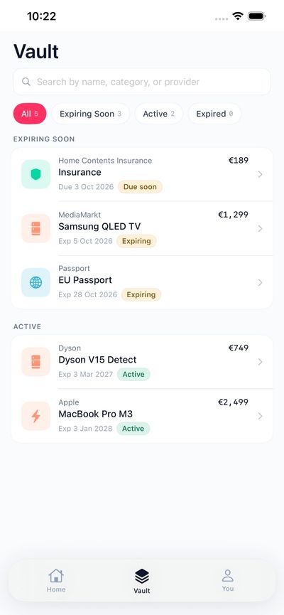
Four states became the visual language of the whole app: colour-coded and scannable in under three seconds. The list is the product.
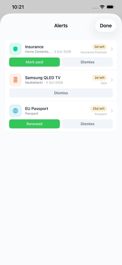
Notifications that aren't noise
Alerts at 90, 30 and 7 days give enough runway to act, not just panic. Timing was the hardest UX decision: too early and people dismiss it, too late and it's useless.
Building without native experience
I'd never shipped a native app. Kotlin Multiplatform gave me one shared logic layer with real SwiftUI on iOS and real Jetpack Compose on Android, which meant learning two platforms while designing for both.
Everything in one place.
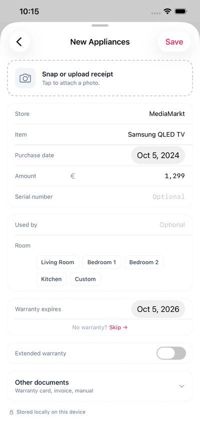
Three core screens. Home shows what needs attention, Vault stores everything and Alerts handles what's due. No onboarding, no account, no syncing: open the app and see.
Native platforms: iOS and Android
Status states with tiered push alerts
Cloud accounts required. Ever.
Claude as co-builder, not autocomplete.
I wrote the code, but Claude held the architectural map while I found my way. Every time the Kotlin–Swift bridge broke, every time a design decision had three equally bad options, every time I needed someone to push back on an idea at 11pm, it was the thinking partner that never tired of the problem.
Architecture decisions
Kotlin Multiplatform over Flutter, because I wanted real SwiftUI, not a wrapper. Tracing the trade-offs before committing made the choice reasoned, not random.
Debugging at depth
When the shared-module migration broke 14 files on iOS, we walked through every compile error together and reached zero errors in one session. Solo, that would have taken days.
Design critique
I'd describe a flow; Claude would ask about the edges. What does an empty home screen teach the user? What does "Expiring Soon" mean at 89 days vs. 2? The right question unlocked the right answer.
A K that watches.
The icon had to work at 29pt and carry the idea of quiet vigilance. The result is a bold K on a warm gradient, orange bleeding into red-pink, unmistakable among grey system icons. Pure geometry: rounded strokes, a tight counter, no decoration. Small, it reads as a clean monogram. Look longer and the negative space between the arms becomes eyes. Watching, always.

Ship the whole thing, once.
Building every layer (icon, UI, code, App Store copy) changed how I think about design. Every constraint I'd dismissed as "an engineering problem" was a design problem in disguise.
Design every edge
Happy-path design is comfortable. Shipping forces you to design the empty state, the error state, the "all documents expired" screen and the notification that arrives after weeks without opening the app.
AI amplifies judgment
Code came fast; the bottleneck was always my taste. A tireless collaborator raised the bar not by reducing effort but by letting me iterate faster toward the right answer.
Hard constraints, better outcomes
No cloud and no account felt limiting, then became the product's strongest differentiator. "Your data stays on your device" is now a headline, not a footnote.
The icon is the brand
Most users never see the About screen. The icon is the one brand touch they carry everywhere, so serious time on 96×96 pixels is the highest-leverage work on a solo project.